
The Lure of the Beautiful Resume
In a competitive job market, the desire to stand out is powerful. Many candidates turn to design tools like Figma, Canva, or specialized templates to create visually stunning resumes that showcase personality and design skill. These resumes often feature custom fonts, intricate layouts, graphical skill meters, and vibrant color palettes.
It feels intuitive: a better-looking document should get more attention. Unfortunately, when applying for roles at medium to large organizations, this pursuit of aesthetic perfection is often the very reason your application stalls before a human ever sees it.
This failure is usually caused by two invisible gatekeepers: the Applicant Tracking System (ATS) and its reliance on Optical Character Recognition (OCR).
What Happens After You Click 'Submit'
When you upload your resume to an online job portal, it doesn't usually go straight to a recruiter's inbox. Instead, it is first ingested by an ATS. The ATS is designed to handle massive volumes of applications, filtering candidates based on keywords, experience, and structured data points. To do this, the system uses OCR technology to read, parse, and extract information from your document.
The ATS converts your visually engaging PDF into raw, structured data fields (Name, Education, Experience, Dates). If the OCR fails to interpret the layout correctly, crucial information is either missed, placed in the wrong field, or rendered as gibberish.
The Invisible Barrier: How OCR Really Works
OCR software is designed to recognize text based on standard, predictable patterns. It looks for solid lines of text, logical headers, and clear formatting. Think of it like a computer trying to read a standardized textbook.
Highly designed resumes, especially those created in graphic design tools, introduce significant parsing challenges:
- Text in Non-Standard Containers: If text is placed inside shapes, curved lines, or complex graphical elements, the OCR may skip it entirely, assuming it’s part of the image, not the core content.
- Column Ambiguity: Two-column or multi-column layouts confuse the reading path. Instead of reading left-to-right, top-to-bottom across the entire page, the OCR might read the top line of the left column, then jump to the top line of the right column, merging unrelated sentences into nonsense.
- Graphical Skill Indicators: Those beautiful percentage bars or icons you used to display skill proficiency are completely ignored. The ATS needs clean, keyword-rich text listings (e.g., 'Python (Expert)', 'SQL (Advanced)').
Why Design Choices Become Rejection Notices
Your intention was to impress, but your design choices create critical technical glitches:
- Custom Fonts: If the OCR engine doesn't recognize the font, it defaults to unreadable squares or random characters. Stick to standard, legible serif or sans-serif fonts (e.g., Arial, Calibri, Times New Roman).
- Low Contrast Text: Light grey text on a colored background or non-standard color choices can be interpreted as blank space by the parser.
- Text as Images: If you exported sections of your Figma design as a single image layer, the text within that image is completely invisible to the ATS.
- Complex Headings: Overly stylized or decorative section headers can prevent the ATS from recognizing vital categories like 'Experience' or 'Education', resulting in a resume where all your professional history is grouped into one unstructured blob.
If you suspect your current design might be tripping up the system, you need to check its readability now. Use an ATS checker or simply copy the text of your PDF into a plain text editor (like Notepad). If the formatting is broken, the ATS is failing to read it. Check if your resume passes the test at our specialized tool: [/ats-check.html].
RolePilot’s Prescription: Structure Over Style
We understand the desire to present yourself professionally, but structure is paramount. As your Candidate Protector, RolePilot advises prioritizing clean, verifiable data extraction over visual flash.
To ensure your resume passes OCR screening:
- Prioritize Single Column Layout: Use standard, structured formatting that reads naturally from top to bottom.
- Use Simple Fonts and Colors: Stick to black text on a white or light background (within the document body). Save color and graphical elements for portfolio links, not the resume itself.
- Avoid Text Boxes and Tables: These elements can confuse the parsing logic. Use standard line breaks and bullet points.
- Save as Text-Selectable PDF or DOCX: Always ensure the PDF is text-selectable, proving that the characters are actual text and not flattened images.
Your goal is to get to the human stage of screening. Once you pass the ATS, your well-organized, readable resume will speak volumes, and your portfolio can deliver the visual punch. Protect your candidacy by mastering the digital gatekeepers.
\n\n \n\n
\n\n \n\n\n
 \n\n\n\n
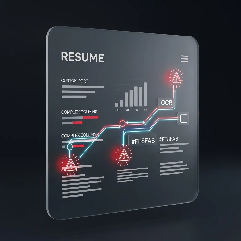 \n
\n